


Hat Patch University
Vinyl Banner DPI: The Complete Resolution Guide for Print-Ready Files

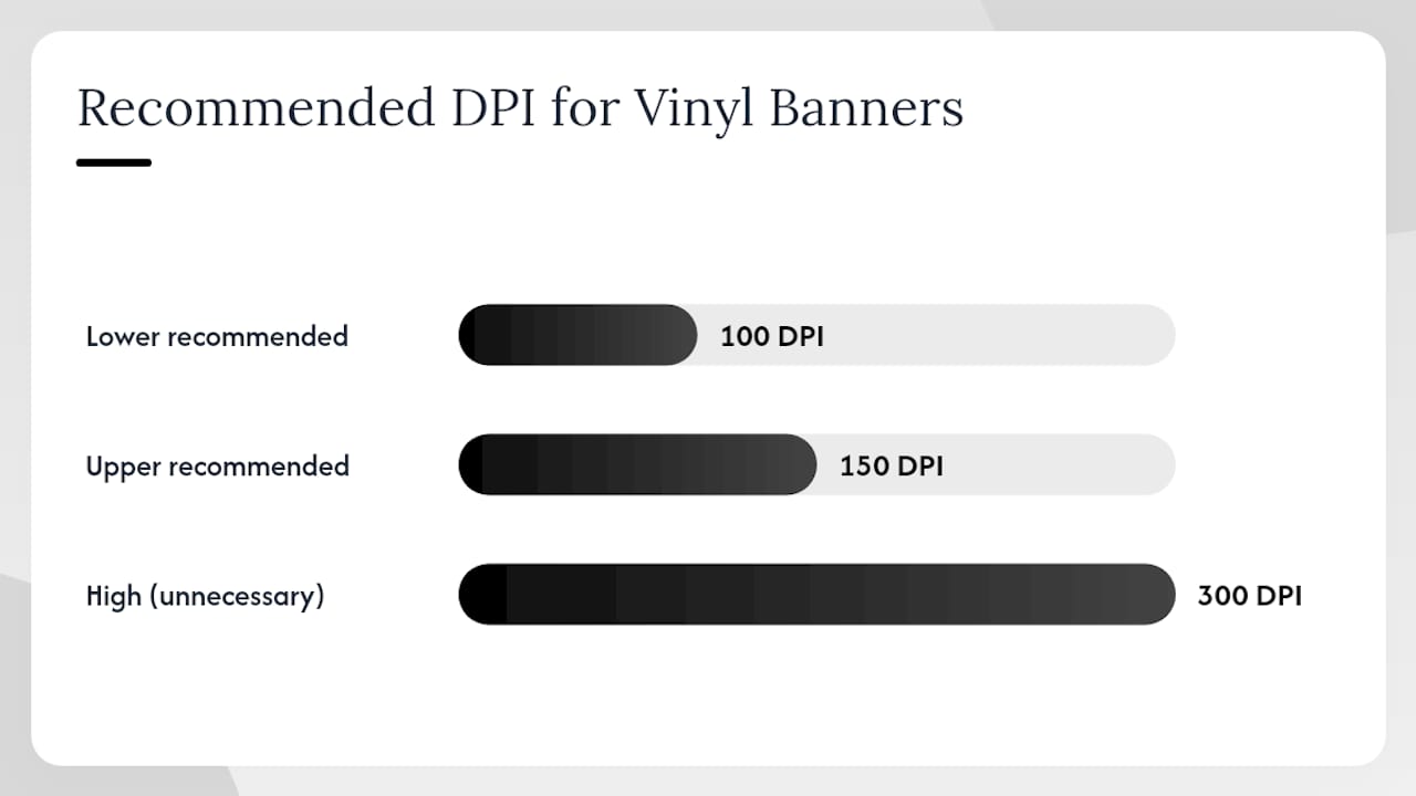
For most vinyl banners, supply raster images at 100–150 DPI at final print size. That single rule covers the majority of event banners, trade-show displays, and outdoor signage. The critical modifier is viewing distance: banners read from across a room or a parking lot can drop to 100 DPI without visible quality loss, while anything with small text, product photography, or a viewing distance under 10 feet should hold at 150 DPI.
The second thing to lock in before opening your design application is scale. If you build the file at 50% of the final print size, you need to double the DPI to compensate. The formula is straightforward:
Required source DPI = target print DPI ÷ design scale
- Designing at 100% (1:1): use 100–150 DPI
- Designing at 50%: use 200–300 DPI
- Designing at 25%: use a DPI high enough to maintain quality, typically several times the target print DPI
- Designing at 10%: use a DPI scaled accordingly, but confirm exact requirements with your printer
Before you finalize any file, confirm the printer’s preferred submission scale, color profile, and bleed requirements. A quick email or phone call before you start saves a reprint.
Key Takeaways
For most vinyl banners, 100–150 DPI at final print size is the correct target; when designing at a reduced scale, multiply the target DPI by the inverse of the scale factor to maintain equivalent pixel density at output.
| Point | Details |
|---|---|
| Standard DPI range | Use 100–150 DPI at final print size; 150 DPI protects small text and close-viewing detail. |
| Design-at-scale formula | Required source DPI = target print DPI ÷ design scale (50% scale = 300 DPI in file). |
| Vector vs. raster rule | Use vector files for logos and text; supply raster photos at 150 DPI minimum at final size in CMYK. |
| File-setup checklist | Set canvas to final print dimensions, add 0.125–0.5 in bleed, embed fonts as outlines, and name files with dimensions and version. |
| Hatpatchsupply production | Hatpatchsupply preflights artwork for resolution and color mode before production on every custom UV patch and banner order. |
Table of Contents
- What vinyl banner DPI should you use for each viewing distance?
- How to calculate pixel dimensions when designing at a reduced scale
- When should you use vector files versus raster files for banners?
- What does a printer-ready file setup look like for vinyl banners?
- How do you check and change image resolution in Photoshop?
- Why does your banner look blurry, and how do you fix it?
- What we have learned from running tight production specs
- Hatpatchsupply brings the same production discipline to custom patches and banners
- Sources
What vinyl banner DPI should you use for each viewing distance?
Viewing distance is the variable that separates a sharp banner from a soft one, and it is the first question to answer before setting canvas resolution. Short viewing distances of roughly 0–10 feet call for 100–150 DPI; large banners viewed from 25 feet or more can drop to 36–96 DPI without the viewer noticing any degradation.
Here is how that plays out across common banner types:
- Indoor POP and countertop displays (0–5 ft): 150 DPI minimum. Viewers stand close enough to read fine print and inspect photos.
- Trade-show headers and step-and-repeat backdrops (5–15 ft): 100–150 DPI. Lean toward 150 if the design includes a logo with thin strokes or readable body copy.
- Event banners and outdoor storefront signs (10–25 ft): 100–150 DPI. A 3×6 ft event banner with mixed text and photography is well served at 150 DPI; a plain color-block design with large type can hold at 100 DPI.
- Stage backdrops and building wraps (25–50 ft+): 72–100 DPI is typically sufficient. At this scale, pixel-level detail is invisible to the audience, and file manageability becomes the bigger concern.
- Billboard-scale and very large outdoor banners (50 ft+): 36–72 DPI at full size is acceptable. Large-format printing does not require the 300 DPI standard used in offset print; the key factors are correct document dimensions and viewing distance.
Two situations always push the DPI requirement up, regardless of banner size:
- Small readable type (under 24 pt at print size): stay at 150 DPI or higher to keep letterforms crisp.
- Product photography or close-up detail shots attached to or displayed alongside the banner: supply those image elements at 150–300 DPI at final size.
How to calculate pixel dimensions when designing at a reduced scale
Most designers working on large banners build files at a reduced scale to keep file sizes manageable and software responsive. The math is simple, but getting it wrong is one of the most common causes of soft-looking prints.
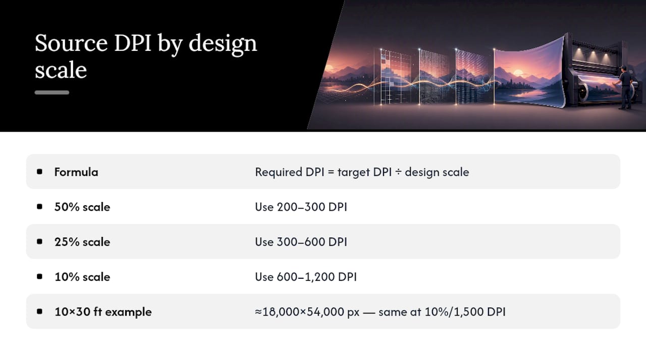
The formula: required source DPI = target print DPI ÷ design scale
Worked examples for a 3×6 ft banner targeting 150 DPI at final print size:
Notice that the pixel dimensions stay identical across all four rows. You are not creating more image data by changing scale; you are just telling the software how to interpret those pixels at output. When designing at 50%, use 200–300 DPI; at 25%, use 300–600 DPI; at 10%, use 600–1,200 DPI, and always confirm the final size and scale with your printer before starting.
Practical limits to keep in mind: A 1:1 file for a 10×30 ft building banner at 150 DPI would require roughly 18,000 × 54,000 pixels, which creates a file that can exceed several gigabytes and may crash standard workstations. Designing at 10% with 1,500 DPI produces the same pixel count in a far more manageable canvas. However, raster photos placed into a reduced-scale document still need to be supplied at the proportionally higher DPI; a 72 DPI web image dropped into a 10% scale file will print at the equivalent of 7.2 DPI at final size.
Pro Tip: Before you start, ask your printer whether they will resample the file on their RIP or expect it at a specific submission scale. Some shops prefer 1:1 at 100 DPI; others accept 10% at 1,000 DPI. Matching their workflow from the start avoids a last-minute rebuild.
For a deeper look at how scaling affects output quality in UV and large-format printing, the image scaling and ratio guide from Hatpatchsupply covers the same principles applied to patch and label production.
When should you use vector files versus raster files for banners?
The short answer: use vectors for everything that is not a photograph, and use high-resolution raster files for everything that is. Getting this distinction right is what separates a clean, press-ready file from one that generates a call from the print shop.
Vectors for logos, text, and line art
Vector files in AI, EPS, or PDF format scale to any size without resolution loss, which makes them the correct choice for logos, icons, typographic headlines, and any line art with hard edges. A logo built in Adobe Illustrator will print just as cleanly on a 2-inch business card as on a 10-foot banner. Before exporting, convert all fonts to outlines (Type > Create Outlines in Illustrator) so the printer’s system does not substitute a missing font. Embed linked artwork or expand it to native paths before saving the final PDF.
The Adobe Illustrator mockup tool from Hatpatchsupply is a useful resource for designers who want to preview vector artwork at scale before committing to a print run.
Raster files for photos and gradients
Photographs, textured backgrounds, and smooth gradients must be supplied as raster files at the correct DPI for the job. Send TIFF, PSD, or high-quality JPG files at a minimum of 150 DPI at final print size for photos and gradients, and work in CMYK whenever possible to avoid color shifts at output. TIFF with LZW compression is the most reliable format for preserving detail without introducing JPEG artifacts.
Color mode matters more than many designers expect. RGB files often look vivid on screen but shift noticeably when converted to CMYK at the RIP. Build your artwork in CMYK from the start, or request the printer’s ICC profile and soft-proof before submitting. If the job uses spot colors, confirm whether the printer’s workflow supports them or requires conversion to process CMYK. For a practical walkthrough of how color handling affects UV print output, the UV printing workflow guide from Hatpatchsupply covers RIP color management in detail.
On flattening: flatten layers before submitting a raster file unless the printer explicitly requests a layered native file for edits. Unflattened transparency can render unpredictably at the RIP, producing unexpected white boxes or missing elements. For PDF submissions, use PDF/X-1a or PDF/X-4 to ensure compatibility with most large-format RIP systems.
What does a printer-ready file setup look like for vinyl banners?
Getting the file right before submission is faster than correcting a rejected proof. Work through this checklist before you send anything to the shop.
- Canvas dimensions: set the document to the exact final print size in inches, not a proxy or placeholder size. Setting the document to final print dimensions and 100–150 DPI covers most vinyl banner jobs; 300 DPI is unnecessary and creates unwieldy file sizes.
- Bleed: add 0.125–0.5 inches of bleed on all sides that will be hemmed or trimmed. Ask the printer for their specific bleed requirement; outdoor banners with pole pockets or sewn hems often need more than the standard 0.125-inch offset bleed.
- Safe area: keep all critical text and logos at least 0.5 inches inside the trim edge. Anything closer risks being obscured by a hem or grommet.
- Color mode: CMYK is the standard for vinyl banner printing. Supply the printer’s ICC profile if they provide one, and embed it in the exported file.
- File format: PDF/X-1a or PDF/X-4 for mixed vector/raster jobs; flattened TIFF for raster-only files; high-quality JPG (maximum quality, no subsampling) as a fallback when the printer specifies it.
- Fonts: convert all type to outlines before export. If submitting a native file, include all font files or package the document.
- Linked images: embed all placed images. A linked image that travels separately from the layout file will not print.
- Transparency: flatten or resolve all transparency before export to avoid RIP rendering issues.
- Finish and hardware: note grommet placement, hem style, and any finishing instructions in a separate document or in the file’s notes field. Do not rely on the printer to guess.
-
File naming: use a clear naming convention that includes the job name, final dimensions, and version number (e.g.,
EventBanner_36x72in_v3_CMYK.pdf). - Proof request: always request a production proof and review it at 100% zoom for small text, fine lines, and color accuracy before approving press.
Pro Tip: If the printer offers a digital soft-proof, open it in Adobe Acrobat with the printer’s output profile loaded and check small text at 100% zoom. A soft-proof catches resolution and color issues before a physical print is made.
For guidance on how file format choices affect DTF and specialty print workflows, the DTF file format guide covers format selection principles that apply across several print processes.
How do you check and change image resolution in Photoshop?
Open the file in Photoshop and go to Image > Image Size (Alt+Ctrl+I on Windows, Option+Command+I on Mac). The dialog shows three values you need to read together: Pixel Dimensions at the top, Document Size in the middle (width and height in inches), and Resolution at the bottom.
The Resolution field only tells you how the software will interpret the pixels at the stated document size. If the pixel dimensions are too low for the print size you need, changing the Resolution field without resampling simply rescales the document size; it does not add image data. To verify whether an image actually has enough pixels, multiply the required print inches by the target DPI: a 12-inch-wide image at 150 DPI needs at least 1,800 pixels across. If the image is 900 pixels wide, it will print at 75 DPI at 12 inches, not 150 DPI.
Resampling versus resizing
Unchecking “Resample” in the Image Size dialog lets you change the document size or resolution without altering pixel count. This is the correct move when you want to tell Photoshop “this image is 12 inches wide at 150 DPI” without generating new pixels. Checking “Resample” tells Photoshop to interpolate new pixels to fill the gap, which can soften detail. When you must resample up, use Preserve Details 2.0 (available in Photoshop CC 2018 and later) for photographs, or Bicubic Smoother for illustrations and graphics. Neither algorithm recovers detail that was never in the original capture, but Preserve Details 2.0 produces noticeably cleaner results than the older Bicubic options for moderate upscaling.
Exporting for print
For raster-only files, save as TIFF with LZW compression and embed the color profile. For jobs that mix vector and raster elements, export as PDF/X from the native application rather than flattening everything in Photoshop first. If the printer requires a JPG, save at maximum quality (12 in Photoshop’s scale) with no chroma subsampling.
Pro Tip: After checking resolution in Image Size, zoom to 100% (View > 100%) and scroll through the image at actual pixel size. If it looks soft at 100% on screen, it will look soft on the banner. This check takes 30 seconds and catches problems that numbers alone miss.
Why does your banner look blurry, and how do you fix it?
Soft or pixelated output almost always traces back to one of three causes: the source image did not have enough pixels for the print size, the file was upscaled without sufficient original data, or a low-resolution logo was placed into an otherwise sharp layout.
Diagnose first. Divide the image’s pixel width by the intended print width in inches. A 600-pixel image placed at 6 inches prints at 100 DPI. At 12 inches, that same image prints at 50 DPI, which will look visibly soft on most banners. Upscaling a small image to meet a DPI requirement often produces poor results; recreating logos as vector art is a more reliable fix.
Common fixes, in order of reliability:
- Supply a higher-resolution original. If the client has a raw camera file or a high-resolution export from the original design application, that is always the cleanest solution.
- Recreate the logo as a vector. For logos, icons, and any line art with hard edges, a vector redraw in Adobe Illustrator or Affinity Designer produces output that is sharp at any size. This is the only fully reliable fix for a low-resolution logo.
- Use an AI upscaler for photographs. Tools like Adobe Firefly’s Generative Upscale, Topaz Gigapixel AI, and Luminar Neo’s upscaling module can recover usable detail from moderately underresolved photos. Results vary significantly depending on the original image content: faces and textures respond well; fine text and geometric patterns often show artifacts. Treat AI upscaling as a last resort for photos, not a substitute for a proper source file.
- Recompose or crop the image. If only part of a photo is needed, cropping to the relevant area and printing it larger can raise the effective DPI without any interpolation.
- Redesign at full size. When the entire layout is built at a scale that is too small and the source assets are marginal, rebuilding the document at 1:1 with corrected assets is faster than trying to fix every element individually.
Pro Tip: Print a small physical proof at 100% scale on a desktop printer before approving a large-format job. Even a 4×6-inch section of the banner printed at actual size reveals whether the resolution is sufficient for the viewing distance.
For a practical look at when vectorizing is the right call versus when upscaling is acceptable, the UV printing vs. laser engraving comparison from Hatpatchsupply discusses how artwork quality affects output across different print processes.
What we have learned from running tight production specs
We follow the same rules outlined in this guide across every print job that goes through our production workflow, and the reason is straightforward: a file that arrives correctly set up ships faster and prints better. The single most common issue we see is a raster logo submitted at screen resolution (72–96 DPI) embedded in an otherwise well-prepared layout. It looks fine at thumbnail size and only reveals itself at 100% zoom or on the physical proof.
Our recommendation is to treat the printer’s spec sheet as a contract, not a suggestion. Request a proof on every new job, and check it at 100% zoom before approving. If you are unsure whether your file meets the resolution requirements, ask for a preflight report. A good print shop will flag problems before they reach the press.
Hatpatchsupply brings the same production discipline to custom patches and banners
When you need custom UV printed patches alongside your vinyl banners, Hatpatchsupply applies the same file-prep standards described in this guide: CMYK artwork, correct DPI at final size, and a preflight check before production begins. No minimums, fast turnaround, and straightforward pricing mean you can order exactly what the job requires without committing to a large run.
Our team reviews submitted artwork for resolution, color mode, and scaling issues before any job goes to press. If your file needs adjustment, we flag it before production, not after. Whether you are ordering a single custom UV patch or a full branded package, submit your files at Hatpatchsupply and we will confirm specs and turnaround before we start.
Sources
Always follow your specific printer’s spec sheet. The sources below cover DPI, scale, bleed, and file-format requirements across several large-format print workflows.
- Large Format File Preparation Checklist: Resolution, Bleed, and Dielines | Design One Printing
Request a proof from your printer on every new job, and confirm their preferred submission scale and color profile before building your document.
Recommended
- Image Ratios in Laser Engraving & UV Printing: Why You Can’t Just Stre – Hat Patch Supply
- The Software Behind the Machines: A Laser Engraving and UV Printing Wo – Hat Patch Supply
- UV Printed Hat Patches: The Complete Guide for Custom Hat Makers - Hat Patch Supply by Hat Foundry
- UV Printed vs. Laser Engraved vs. Embroidered Hat Patches: Which Shoul – Hat Patch Supply
Ready to press your own?
Custom UV patches with no minimum, shipped in 72 hours — or grab a free-shipping sample pack first.